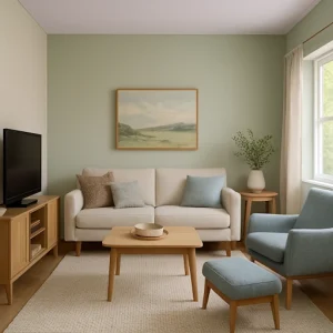
Finding the best colors for small living rooms can completely transform how spacious your room feels. Color psychology is vital in living room design, affecting everything from perceived dimensions to mood and atmosphere. When selecting the best colors for small living rooms, consider both visual appeal and the psychological impact of different hues.
Find your perfect living room colors based on color psychology and your specific needs:
Room Color Psychology Quiz
Find your desired color combinations to create the perfect mood for every room in your home!
What is your favorite color?
Let’s explore how the right color choices can visually expand your space while creating the perfect atmosphere for your home.
2025 Trends for the Best Colors for Small Living Rooms
 In 2025, we’re seeing a shift toward colors that create both visual space and emotional comfort in small living rooms. Here are the trending approaches for the best colors for small living rooms:
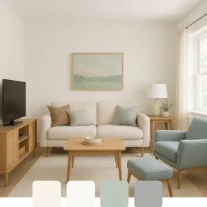
Light Neutrals With Depth
Gone are the days of flat white walls. Today’s small living rooms benefit from neutrals with subtle undertones that shift throughout the day. Colors like Benjamin Moore’s “Balboa Mist” and Sherwin Williams’ “Egret White” provide dimension without overwhelming the space. These modern neutral colors for small rooms add character while maintaining an open feel.
Joanna Gaines (Magnolia Journal, Spring 2023): “For small living rooms, I often turn to warm neutrals that create depth without overwhelming the space. A soft greige can make walls recede while still offering more character than plain white.”
Strategic Color Zoning
Designers are using color to define functional areas within small living rooms. A slightly deeper tone behind a media center or a contrasting color for a reading nook helps organize the space visually without physical barriers. This optical illusion paint technique creates the perception of separate zones without adding walls that would make your space feel smaller.
Nature-Inspired Palettes
Bringing the outdoors in remains strong in 2025, with soft sage greens, subtle blues, and sandy beiges creating a connection to nature while visually expanding walls. These hues recede rather than advance, making them perfect for tight spaces. The best colors for small living rooms often include these nature-inspired tones that promote relaxation while enhancing space.
Bobby Berk (Architectural Digest interview): “One of the biggest misconceptions is that small spaces need to be white. I actually love using color in small rooms - it’s about choosing the right tone. A soft blue-gray can make a small living room feel like it extends into the horizon.”
This approach has been effectively demonstrated in several award-winning small space designs at recent interior design shows, where sage green walls created the illusion of bringing the outdoors in while making compact living areas feel more expansive.
Ceiling as the “Fifth Wall”
Painting ceilings in lighter versions of wall colors or unexpected soft hues like pale lavender or blush can draw the eye upward, creating the illusion of height in rooms with low ceilings. This space-enhancing living room color technique is particularly effective in minimalist and Scandinavian-style interiors where simplicity is key.
Emily Henderson said, “When working with small living rooms, I’m a big fan of painting the ceiling, trim, and walls the same color. It blurs the boundaries of where the walls end, creating the illusion of more space.”
Practical Color Solutions: Best Colors for Small Living Rooms By Situation
Small Spaces: Colors That Create Depth
Small living rooms benefit from colors that make walls appear to recede:
- Behr “Silver Drop” (790C-3) - This pale greige creates depth while remaining light enough to reflect available light. Perfect for rooms where you want softness without stark white.
- Sherwin Williams “Topsail” (SW 6217) - A barely-there blue that reads as a neutral but adds a subtle dimension that plain white can’t match.
- Benjamin Moore “Pale Oak” (OC-20) - A sophisticated light neutral with warm undertones that prevents the closed-in feeling darker beiges can create.
Implementation Tip: Paint trim and moldings the same color as walls but in a semi-gloss finish while keeping the walls matte. This creates a subtle definition without chopping up the space, a key consideration when choosing the best colors for small living rooms.
Limited Natural Light: Colors That Maximize Brightness
- Farrow & Ball “Cabbage White” (269) - Despite its name, this green-gray undertone creates a sense of natural light even in dim spaces.
- Valspar “Filtered Rays” (7006-17) - A warm cream with subtle yellow undertones mimicking sunshine, making artificially lit rooms naturally brighter.
- Benjamin Moore “Cloud White” (OC-130) - A soft, diffused white that doesn’t appear harsh or stark in rooms with minimal natural light.
Nate Berkus (The Things That Matter, page 134): “For smaller spaces, I often choose paints with a slight sheen. The reflective quality bounces light around the room, making it feel more expansive than it actually is.”
Implementation Tip: In rooms with limited windows, use the same color on walls, ceiling, and trim to eliminate shadow lines that can make the space feel smaller. Light-reflecting paint for small spaces becomes particularly important in these conditions.
Open-Concept Considerations: Creating Cohesion
- Sherwin Williams “Agreeable Gray” (SW 7029) - This chameleon-like warm gray works with virtually any accent color and creates a cohesive backdrop for adjoining spaces.
- Benjamin Moore “Classic Gray” (OC-23) - Light enough to maximize space but with enough color to provide definition between areas.
- PPG “Delicate White” (PPG1086-2) - A versatile off-white that takes on different characteristics as lighting changes throughout open areas.
Shea McGee (Dream Home Makeover, Season 3, Episode 4): “In a small space, I approach color from a holistic perspective. Rather than just thinking about the walls, I consider how all surfaces - walls, trim, ceiling, and even furniture - work together to create depth.”
Implementation Tip: Use the same color throughout open areas but vary the intensity by 10-20% between spaces to create subtle definition without disconnecting them. This approach works beautifully in modern farmhouse and transitional interiors.
Working With Existing Elements: Harmonizing Colors
- Sherwin Williams “Repose Gray” (SW 7015) - A perfect middle-ground neutral that works with cool and warm flooring and furniture tones.
- Benjamin Moore “Edgecomb Gray” (HC-173) - A chameleon color that adapts beautifully to existing brown wood tones and cool gray furnishings alike.
- Farrow & Ball “Strong White” (2001) - Despite its name, this complex neutral has subtle gray-green undertones that complement existing natural elements.
Implementation Tip: Test colors beside existing fixed elements like flooring, stone fireplaces, or built-ins rather than viewing them in isolation. Small apartment color schemes particularly benefit from this harmonized approach.
This principle is evident in the work of designers specializing in small urban apartments, where successful projects consistently show colors explicitly selected to complement existing architectural elements rather than being chosen in isolation.
Curated Ready-To-Use Color Palettes: The Best Colors for Small Living Rooms
Calm & Airy
 Perfect for small living rooms needing maximum light diffusion:
- Main wall color: Benjamin Moore “White Dove” (OC-17)
- Trim/ceiling: Benjamin Moore “Chantilly Lace” (OC-65)
- Accent: Sherwin Williams “Sea Salt” (SW 6204)
- Secondary accent: Benjamin Moore “Stonington Gray” (HC-170)
Best uses: The main color works brilliantly on all walls, with Sea Salt as a subtle accent wall behind the main seating to create depth without closing in the space. This palette exemplifies the best white paint for small living rooms paired with soft, space-enhancing accents.
Soft & Sophisticated
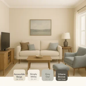 A palette that creates dimension without overwhelming:
- Main wall color: Sherwin Williams “Accessible Beige” (SW 7036)
- Trim/ceiling: Benjamin Moore “Simply White” (OC-117)
- Accent: Benjamin Moore “Gray Owl” (OC-52)
- Secondary accent: Sherwin Williams “Urbane Bronze” (SW 7048) (for small accents only)
Best uses: Use the main color throughout, with Gray Owl on a focal wall. Urbane Bronze works best as a furniture color or for small details like picture frames or lamp bases. This palette exemplifies the best colors for small living rooms that need sophistication. These colors work in perfect harmony for spaces that need to feel larger while maintaining warmth.
See These Colors In Your Own Living Room
Modern & Refreshing
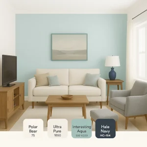 A contemporary palette that visually expands walls:
- Main wall color: Behr “Polar Bear” (75)
- Trim/ceiling: Behr “Ultra Pure White” (1850)
- Accent: Sherwin Williams “Interesting Aqua” (SW 6220)
- Secondary accent: Benjamin Moore “Hale Navy” (HC-154) (for small accents only)
Best uses: The bright white main color maximizes light reflection, while the aqua creates a focal point when used sparingly. The Hale Navy color should be limited to decor items and furnishings. Among the best colors for small living rooms in 2025, this fresh combination exemplifies the small living room paint ideas designers are embracing.
Warm & Inviting
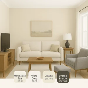 Creates intimacy without shrinking the space:
- Main wall color: Benjamin Moore “Manchester Tan” (HC-81)
- Trim/ceiling: Benjamin Moore “White Dove” (OC-17)
- Accent: Sherwin Williams “Creamy” (SW 7012)
- Secondary accent: Sherwin Williams “Urbane Bronze” (SW 7048)
Best uses: Manchester Tan creates a warm, cozy envelope without closing in. Use Creamy on the ceiling to lift the space visually. When considering the best colors for small living rooms, color psychology suggests these warmer tones create comfort while maintaining openness.
Traditional Vs. AI-Powered Color Testing
Yesterday’s Approach
Traditional color testing for small living rooms has significant limitations:
- Paint swatches from stores look entirely different when applied to your walls, often appearing much darker or more intense.
- Small sample boards don’t show how color truly affects the perception of your room’s size.
- Painting test patches requires multiple coats for accuracy, and still only shows you a small area.
- Waiting days or weeks between trying different colors significantly extends your project timeline.
- Visualizing how multiple colors work together as a complete scheme is nearly impossible with physical samples alone.
- Finding the best colors for small living rooms that truly enhance your space requires testing more than a few options, which can be expensive and time-consuming.
Most homeowners remember the disappointment of painting an entire small living room only to discover the color makes the space feel like a cave.
Today’s Smart Solution
AI visualization tools have revolutionized how we test colors for small spaces:
- Instantly see any color on your actual living room walls through your smartphone or tablet.
- Test dozens of color options in minutes rather than days, comparing how each affects your space perception.
- View colors under different lighting conditions—morning, afternoon, and evening—to ensure they work throughout the day.
- Visualize complete color schemes together, including how accent colors interact with your main wall color.
- Make decisions with confidence by comparing options side-by-side in your exact room.
- Share options digitally with family members or designers for second opinions.
- Eliminate costly color mistakes that make your small room feel even smaller.
Join The Future Of Design - See Colors In Your Living Room Now
Professional designers have widely adopted these visualization tools in their practices, with many noting significant improvements in client satisfaction and fewer color corrections after painting. These digital solutions have been highlighted at recent design industry events as particularly valuable for small spaces where color mistakes are more visually apparent.
While physical color samples still have value as a final confirmation step, leading designers now recommend digital visualization first, especially for small spaces where color mistakes are more noticeable.
Common Questions About the Best Colors for Small Living Rooms
Will Dark Colors Always Make My Small Living Room Feel Smaller?
Not necessarily. While conventional wisdom suggests light colors are always best for small spaces, strategically using darker colors can create depth. The key is placement—using deeper colors on a focal wall at a room’s far end can make the space feel longer. Darker colors like Sherwin Williams “Naval” (SW 6244) can create a sophisticated backdrop that visually recedes when paired with proper lighting.
This counters one of the most persistent misconceptions in small space design. According to established color theory principles, deep hues on a focal wall create perceived depth because darker colors appear to recede. Several recent small space makeovers featured in design publications have successfully demonstrated this technique, using colors like Sherwin Williams’ “Naval” to add dimension rather than constriction.
How Do I Choose Between Cool and Warm Tones for a Small Living Room?
Consider your natural light exposure. North-facing rooms benefit from warm tones like Benjamin Moore’s “Swiss Coffee” (OC-45), which counter the cooler natural light. South-facing rooms can handle cooler tones like Sherwin Williams’ “Misty” (SW 6232), which balance the warm sunlight. East—and west-facing rooms change dramatically throughout the day, making versatile neutrals like Benjamin Moore’s “Balboa Mist” (OC-27) ideal.
What’s the Best Ceiling Color to Make a Small Living Room Feel Taller?
While white is traditional, painting the ceiling a lighter version of your wall color can remove the stark cutoff line that emphasizes room boundaries. For maximum height perception, try a pale blue like Benjamin Moore’s “Breath of Fresh Air” (806) or a soft lavender like Sherwin Williams’ “Breathtaking” (SW 6814), which mimics the sky and draws the eye upward. These optical illusion paint techniques can significantly impact how spacious your room feels.
How Many Different Colors Can I Use in a Small Living Room?
Limit your palette to 3-4 colors maximum. Use the 60-30-10 rule: 60% should be your main color (walls), 30% your secondary color (large furniture), and 10% your accent color (accessories). Adding a fourth color should only be done cautiously and limited to small decorative items. The best colors for small living rooms work together harmoniously rather than competing for attention.
Quick Decision Guide for Choosing the Best Colors for Small Living Rooms
If you’re feeling overwhelmed by options, this simplified framework will help you make the right color choice for your small living room:
If your living room faces north, choose warm-toned neutrals like Benjamin Moore’s Ballet White (OC-9) or Sherwin Williams’ Alabaster (SW 7008) to counteract cool light.
If your living room has low ceilings, then paint the ceiling Sherwin Williams “Extra White” (SW 7006) in a flat finish and walls in a slightly deeper tone to create the illusion of height.
If you have dark furniture, balance it with light-to-medium wall colors with warm undertones, like Benjamin Moore’s “Manchester Tan” (HC-81), to prevent the space from feeling top-heavy.
If your space lacks architectural interest, use a slightly deeper color like Farrow & Ball “Skylight” (205) to add dimensions that flat white can’t provide.
If your small living room adjoins other spaces, choose an adaptable neutral like Sherwin Williams “Agreeable Gray” (SW 7029) to create cohesion throughout. This approach uses the best colors for small living rooms to create a seamless flow between areas.
Looking for the best colors for small living rooms that truly work? Find your perfect living room colors based on color psychology and your specific needs:
Room Color Psychology Quiz
Find your desired color combinations to create the perfect mood for every room in your home!
What is your favorite color?
When it comes to selecting the best colors for small living rooms, visualization is key to success. See your choices in context before committing.
Ready To Decide? See Colors In Your Actual Living Room
