Searching for perfect dining room color ideas to transform your space in 2025?
 The dining room serves as both a gathering place for family meals and a showpiece for entertaining guests, making color selection particularly important.
Beyond aesthetics, color psychology is important in dining room design, influencing everything from appetite to conversation flow.
Find your perfect dining room colors based on color psychology and your specific needs:
Choose Your Dining Room Color Ideas Based On:
- Room size and ceiling height
- Natural light direction and intensity
- Existing furniture and fixtures
- Desired mood (energizing, calming, dramatic)
- Adjacent room colors and flow
- Time of day you typically use the space
Room Color Psychology Quiz
Find your desired color combinations to create the perfect mood for every room in your home!
What is your favorite color?
Let’s explore these inspiring dining room color ideas for 2025 that combine both style and function.
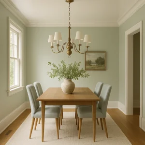
Dining Room Color Ideas with Scandinavian-Inspired Elegance
When exploring dining room color ideas, the top trending dining room styles for 2025 include:
- Scandinavian: Light, airy, and functional with natural wood tones and a minimalist approach
- Modern Farmhouse: Rustic elements mixed with contemporary clean lines and neutral palettes
- Japandi: Japanese minimalism meets Scandinavian functionality with natural materials and earth tones
- Contemporary: Current trends featuring mixed textures, statement lighting, and bold accent colors
- Transitional: Balanced blend of traditional and modern elements with sophisticated neutral palettes
Emerging regional styles gaining global popularity:
- Mediterranean: Earthy tones, terracotta, and statement blues inspired by coastal European dining
- Australian Coastal: Relaxed, light-filled spaces with natural textures and subtle oceanic color palettes
READY-TO-USE COLOR PALETTES
Warm & Inviting Dining Room Color Ideas (Modern Farmhouse)
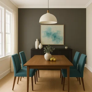
- Main wall color: Sherwin-Williams Accessible Beige SW 7036
- Trim/ceiling color: Benjamin Moore Simply White OC-117
- Accent colors:
- Sherwin-Williams Urbane Bronze SW 7048 (for furniture or accent wall)
- Benjamin Moore Aegean Teal 2136-40 (for decorative elements)
- Room elements: Use Accessible Beige for main walls, Simply White for trim and ceiling, Urbane Bronze for a buffet or accent wall, and Aegean Teal for dining chairs or artwork.
Designer Shea McGee notes, “Warm neutrals create an inviting atmosphere that makes guests want to linger at the table longer. The key is choosing deep neutrals that change subtly throughout the day.”
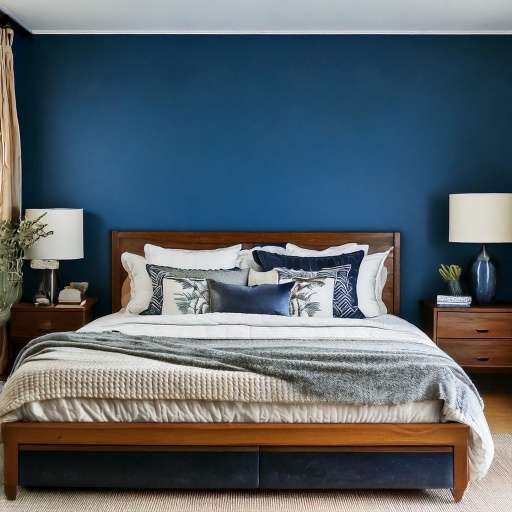
Bold & Sophisticated Dining Room Color Ideas (Contemporary)
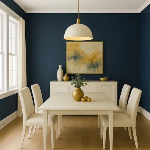
- Main wall color: Benjamin Moore Hale Navy HC-154
- Trim/ceiling color: Benjamin Moore Cloud White OC-130
- Accent colors:
- Sherwin-Williams Alabaster SW 7008 (for furniture)
- Benjamin Moore Gold Leaf 2151-20 (for decorative accents)
- Room elements: Use Hale Navy for all walls or just one accent wall, Cloud White for trim and ceiling, Alabaster for dining chairs or buffet, and Gold Leaf for light fixtures, frames, or tableware.
“Navy blue dining rooms create a sense of occasion,” explains designer Emily Henderson. “It’s formal enough for special gatherings but can feel casual and livable for everyday use when paired with lighter elements.”
Visualize These Palettes In Your Space Now
Serene & Natural Dining Room Color Ideas (Japandi)
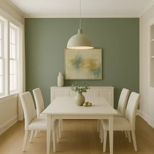
- Main wall color: Sherwin-Williams Evergreen Fog SW 9130
- Trim/ceiling color: Benjamin Moore White Dove OC-17
- Accent colors:
- Sherwin-Williams Shoji White SW 7042 (for furniture)
- Benjamin Moore Pale Oak OC-20 (for secondary walls)
- Room elements: Use Evergreen Fog for the main walls, White Dove for the trim and ceiling, Shoji White for the dining chairs or buffet, and Pale Oak for adjacent walls or built-ins.
“Soft sage greens connect to nature while creating a calming backdrop for meals,” says designer Leanne Ford. “This palette works beautifully with both light woods and darker furniture pieces, making it incredibly versatile.”
Dramatic & Moody (Transitional)
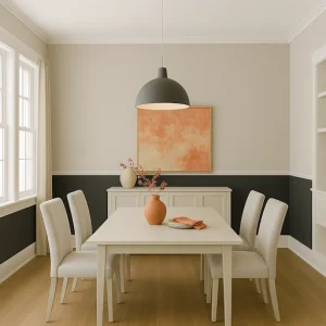
- Main wall color: Benjamin Moore Chimney Sweep 1483
- Trim/ceiling color: Sherwin-Williams Pure White SW 7005
- Accent colors:
- Benjamin Moore Revere Pewter HC-172 (for adjacent walls)
- Sherwin-Williams Coral Clay SW 9005 (for accents)
- Room elements: Use Chimney Sweep for main walls or just the lower half for a modern chair rail effect, Pure White for trim and ceiling, Revere Pewter for connecting spaces, and Coral Clay for artwork, centerpieces, or napkins.
“Charcoal walls in dining rooms are unexpectedly beautiful,” notes designer Bobby Berk. “They make white dishware pop and create an intimate atmosphere, especially with strategic lighting.”
Light & Airy (Scandinavian)
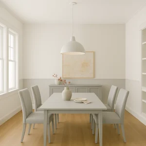
- Main wall color: Benjamin Moore Chantilly Lace OC-65
- Trim/ceiling color: Same as wall color
- Accent colors:
- Sherwin-Williams Skyline Steel SW 1015 (for subtle accent wall)
- Benjamin Moore Gray Owl OC-52 (for furniture or built-ins)
- Room elements: For a seamless look, use Chantilly Lace for walls and trim, Skyline Steel for a subtle accent wall or architectural details, and Gray Owl for dining furniture or adjacent spaces.
Designer Hilary Farr explains, “White dining rooms with subtle contrasts create a sense of calm that’s perfect for meaningful family gatherings. The key is using whites with the right undertones for your light conditions.”
PRACTICAL DINING ROOM COLOR IDEAS BY SITUATION
Dining Room Color Ideas For Smaller Spaces
Small dining rooms benefit from colors that create a sense of expansiveness without feeling cold:
- Benjamin Moore Classic Gray OC-23: This soft, warm gray reflects light beautifully, making spaces feel larger without the starkness of pure white.
- Sherwin-Williams Sea Salt SW 6204: A barely-there green-gray that adds subtle color while maintaining an open feel.
- Implementation tip: Paint crown molding and trim the same color as walls to create height, or use a high-gloss finish on the ceiling to reflect more light downward.
“In small dining areas, I often recommend turning the wall color onto the ceiling but in a 50% lighter formula,” designer Breegan Jane explains. “This blurs boundaries and creates the illusion of more space.”
Try These Colors On Your Dining Room Walls
Dining Rooms with Limited Natural Light
These dining room color ideas work best for spaces with minimal windows, north-facing or window-challenged dining rooms that need colors to compensate for lack of sunshine:
- Benjamin Moore Golden Retriever 2165-30: This warm yellow-gold brings sunshine into dark spaces without being overpowering.
- Sherwin-Williams Marshmallow SW 7001: A warm white that maintains brightness without looking cold or gray in limited light.
- Implementation tip: Use semi-gloss or satin finishes to maximize light reflection, and consider a warm-toned ceiling color rather than stark white.
Open-Concept Considerations
When your dining area flows into other spaces, color coordination becomes crucial:
- Benjamin Moore Pale Oak OC-20: A versatile light neutral that plays well with adjacent room colors.
- Sherwin-Williams Repose Gray SW 7015: A medium-toned neutral that can serve as a transition between different color zones.
- Implementation tip: Consider using the same trim color throughout connected spaces while varying wall colors, or create a cohesive flow with different intensities of the same color family.
Designer Nate Berkus advises, “In open-concept homes, think of color as a way to define zones while maintaining harmony. The dining area can have its own personality while still relating to adjacent spaces through complementary tones.”
Working with Existing Elements
Select dining room color ideas that complement your current furnishings and coordinate with existing flooring or fixtures:
- For dark wood furniture, Benjamin Moore Collingwood OC-28 creates a beautiful contrast without fighting with wood tones.
- For light wood furniture, Sherwin-Williams Naval SW 6244 provides a dramatic contrast that highlights the beauty of lighter woods.
- For marble or stone elements: Benjamin Moore Stonington Gray HC-170 complements natural stone beautifully without competing.
- Implementation tip: Always test colors next to your fixed elements in both natural and artificial lighting before committing.
DINING ROOM COLOR IDEAS QUICK DECISION GUIDE
If you’re feeling overwhelmed by choices, use these simple guidelines for finding the perfect dining room color ideas:
- If your dining room faces north, then consider these warmer tones:
- Benjamin Moore Manchester Tan HC-81
- Sherwin-Williams Creamy SW 7012
- Benjamin Moore Golden Retriever 2165-30
- If your dining room faces south, then these cooler tones will balance the warm light:
- Sherwin-Williams Silver Strand SW 7057
- Benjamin Moore Wickham Gray HC-171
- Sherwin-Williams Evergreen Fog SW 9130
- If you have dark furniture, then these wall colors will balance the space:
- Benjamin Moore Simply White OC-117
- Sherwin-Williams Alabaster SW 7008
- Benjamin Moore Pale Oak OC-20
- If you have light furniture, then these wall colors will create a beautiful contrast:
- Benjamin Moore Hale Navy HC-154
- Sherwin-Williams Urbane Bronze SW 7048
- Benjamin Moore Chimney Sweep 1483
- If you primarily use your dining room at night, then colors that glow under artificial light include:
- Benjamin Moore Golden Straw 2152-50
- Sherwin-Williams Coral Clay SW 9005
- Benjamin Moore Wedgewood Gray HC-146
Make A Confident Choice: Preview Colors At Home
TRADITIONAL VS. AI-POWERED COLOR TESTING
Yesterday’s Approach
Traditional methods of selecting dining room color ideas come with significant limitations:
- Paint swatches that look drastically different on walls than in stores
- Small sample boards that don’t show how color flows around the entire room
- Time-consuming test patches that require multiple coats for accurate representation
- Days or weeks of waiting to see results while living with patchwork walls
- Difficulty visualizing complete color schemes together with furniture and decor
- Limited ability to test multiple options quickly during the decision process
“I’ve had clients paint seven different test patches on their dining room walls and still feel uncertain,” says designer Nicole Gibbons. “The traditional method is messy and often leads to decision paralysis.”
Today’s Smart Solution
AI visualization tools have revolutionized the dining room color selection process:
- Instant visualization of color on your actual walls using photos of your space
- Testing dozens of colors in minutes instead of days or weeks
- Seeing colors under different lighting conditions (morning, afternoon, evening)
- Visualizing complete color schemes together with your existing furniture
- Easier decision-making with side-by-side comparisons of multiple options
- Sharing options digitally with family members or designers for collaborative decisions
- Eliminating costly color mistakes and regrets before committing to paint
Designer Jeremiah Brent explains, “Technology has transformed how we approach color. I can now show clients exactly how a dining room will look in different colors before touching a paintbrush, which builds confidence in bolder choices.”
These tools solve specific dining room challenges:
Problem: “The color looked completely different once it was on my whole wall” Traditional approach: Paint large test patches on multiple walls, wait for them to dry, and hope they’re representative AI solution: See exactly how a color looks across your entire dining room instantly, accounting for existing lighting conditions and architectural features
Problem: “I can’t visualize how all the colors work together.” Traditional approach: Collect dozens of paint chips and try to arrange them in meaningful combinations. AI solution: Apply complete color schemes to your dining room virtually, seeing exactly how wall colors interact with trim, ceiling, and accent colors
Problem: “I’m afraid to try bold colors because I can’t visualize the end result.” Traditional approach: Play it safe with neutral colors to avoid expensive mistakes. AI solution: Experiment with statement colors like navy, emerald, or terracotta without commitment, seeing exactly how they’d transform your dining space
While leading designers recommend seeing physical samples as a final confirmation step, the consensus is clear that digital visualization should come first in the decision process.
See Your Dream Dining Room Before You Paint
FREQUENTLY ASKED QUESTIONS ABOUT DINING ROOM COLOR IDEAS
What colors make a dining room look bigger?
Lighter colors generally make dining rooms appear more spacious, but that doesn’t mean you’re limited to white. Soft, muted tones like Benjamin Moore Classic Gray OC-23 or Sherwin-Williams Sea Salt SW 6204 create an open feel while adding more interest than plain white. For small dining rooms, consider painting trim and walls the same color to eliminate visual breaks that can make the space feel chopped up.
Should the dining room be the same color as the living room?
In open-concept homes, your dining room doesn’t need to match your living room exactly, but the colors should complement each other. Consider using different shades from the same color family, or colors with similar undertones. If your living room is Sherwin-Williams Repose Gray SW 7015, your dining room could be the slightly deeper Mindful Gray SW 7016 to create distinction while maintaining harmony.
What’s the best lighting color temperature for dining rooms?
For dining rooms, warm lighting between 2700K and 3000K creates the most flattering and inviting atmosphere. This warmer light enhances food presentation and skin tones, making everyone look their best. When selecting paint colors, always test them under this warm lighting rather than cooler daylight, as colors can appear significantly different.
Are dark colors practical for dining rooms?
Dark colors can be surprisingly practical in dining rooms, especially for evening entertainers. Colors like Benjamin Moore Hale Navy HC-154 or Sherwin-Williams Urbane Bronze SW 7048 hide inevitable food and beverage splashes better than lighter colors. The key to success with darker colors is ensuring adequate lighting and using lighter elements (trim, ceiling, or furniture) to create balance.
Transform Your Dining Room With These Colors
How do I choose a dining room color that won’t go out of style?
For longevity, consider timeless colors like Sherwin-Williams Accessible Beige SW 7036 or Benjamin Moore Revere Pewter HC-172. These sophisticated dining room color ideas have proven staying power and can be updated with trendy accent colors through easily changeable elements like artwork, table linens, or centerpieces. If you prefer more color, muted versions of classic hues like navy, olive green, or terracotta tend to age better than bright or trendy colors. For more dining room inspiration beyond colors, Architectural Digest’s dining room guide showcases how these principles apply in designer spaces.
Which of these dining room color ideas do you prefer?